The Science of Temperature
by James Hansen
Background
My experience with global temperature data over 30 years provides insight about how the science and its public perception have changed. In the late 1970s I became curious about well known analyzes of global temperature change published by climatologist J. Murray Mitchell: why were his estimates for large-scale temperature change restricted to northern latitudes? As a planetary scientist, it seemed to me there were enough data points in the Southern Hemisphere to allow useful estimates both for that hemisphere and for the global average. So I requested a tape of meteorological station data from Roy Jenne of the National Center for Atmospheric Research, who obtained the data from records of the World Meteorological Organization, and I made my own analysis.
Fast forward to December 2009, when I gave a talk at the Progressive Forum in Houston Texas. The organizers there felt it necessary that I have a police escort between my hotel and the forum where I spoke. Days earlier bloggers reported that I was probably the hacker who broke into East Anglia computers and stole e-mails. Their rationale: I was not implicated in any of the pirated e-mails, so I must have eliminated incriminating messages before releasing the hacked emails. The next day another popular blog concluded that I deserved capital punishment. Web chatter on this topic, including indignation that I was coming to Texas, led to a police escort.
How did we devolve to this state? Any useful lessons? Is there still interesting science in analyses of surface temperature change? Why spend time on it, if other groups are also doing it?
First I describe the current monthly updates of global surface temperature at the Goddard Institute for Space Studies. Then I show graphs illustrating scientific inferences and issues. Finally I respond to questions in the above paragraph.
Current Updates
Each month we receive, electronically, data from three sources: weather data for several thousand meteorological stations, satellite observations of sea surface temperature, and Antarctic research station measurements. These three data sets are the input for a program that produces a global map of temperature anomalies relative to the mean for that month during the period of climatology, 1951-1980.
The analysis method has been described fully in a series of refereed papers (Hansen et al., 1981, 1987, 1999, 2001, 2006). Successive papers updated the data and in some cases made minor improvements to the analysis, for example, in adjustments to minimize urban effects. The analysis method works in terms of temperature anomalies, rather than absolute temperature, because anomalies present a smoother geographical field than temperature itself. For example, when New York City has an unusually cold winter, it is likely that Philadelphia is also colder than normal. The distance over which temperature anomalies are highly correlated is of the order of 1000 kilometers at middle and high latitudes, as we illustrated in our 1987 paper.
Although the three input data streams that we use are publicly available from the organizations that produce them, we began preserving the complete input data sets each month in April 2008. These data sets, which cover the full period of our analysis, 1880-present, are available to parties interested in performing their own analysis or checking our analysis. The computer program that performs our analysis is published on the GISS web site.
Responsibilities for our updates are as follows. Ken Lo runs programs to add in the new data and reruns the analysis with the expanded data. Reto Ruedy maintains the computer program that does the analysis and handles most technical inquiries about the analysis. Makiko Sato updates graphs and posts them on the web. I examine the temperature data monthly and write occasional discussions about global temperature change.

Scientific Inferences and Issues
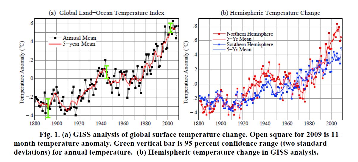
Temperature data – example of early inferences. Figure 1 shows the current GISS analysis of global annual-mean and 5-year running-mean temperature change (left) and the hemispheric temperature changes (right). These graphs are based on the data now available, including ship and satellite data for ocean regions.
Figure 1 illustrates, with a longer record, a principal conclusion of our first analysis of temperature change (Hansen et al., 1981). That analysis, based on data records through December 1978, concluded that data coverage was sufficient to estimate global temperature change. We also concluded that temperature change was qualitatively different in the two hemispheres. The Southern Hemisphere had more steady warming through the century while the Northern Hemisphere had distinct cooling between 1940 and 1975.
It required more than a year to publish the 1981 paper, which was submitted several times to Science and Nature. At issue were both the global significance of the data and the length of the paper. Later, in our 1987 paper, we proved quantitatively that the station coverage was sufficient for our conclusions – the proof being obtained by sampling (at the station locations) a 100-year data set of a global climate model that had realistic spatial-temporal variability.
The different hemispheric records in the mid-twentieth century have never been convincingly explained. The most likely explanation is atmospheric aerosols, fine particles in the air, produced by fossil fuel burning. Aerosol atmospheric lifetime is only several days, so fossil fuel aerosols were confined mainly to the Northern Hemisphere, where most fossil fuels were burned. Aerosols have a cooling effect that still today is estimated to counteract about half of the warming effect of human-made greenhouse gases. For the few decades after World War II, until the oil embargo in the 1970s, fossil fuel use expanded exponentially at more than 4%/year, likely causing the growth of aerosol climate forcing to exceed that of greenhouse gases in the Northern Hemisphere. However, there are no aerosol measurements to confirm that interpretation. If there were adequate understanding of the relation between fossil fuel burning and aerosol properties it would be possible to infer the aerosol properties in the past century. But such understanding requires global measurements of aerosols with sufficient detail to define their properties and their effect on clouds, a task that remains elusive, as described in chapter 4 of Hansen (2009).

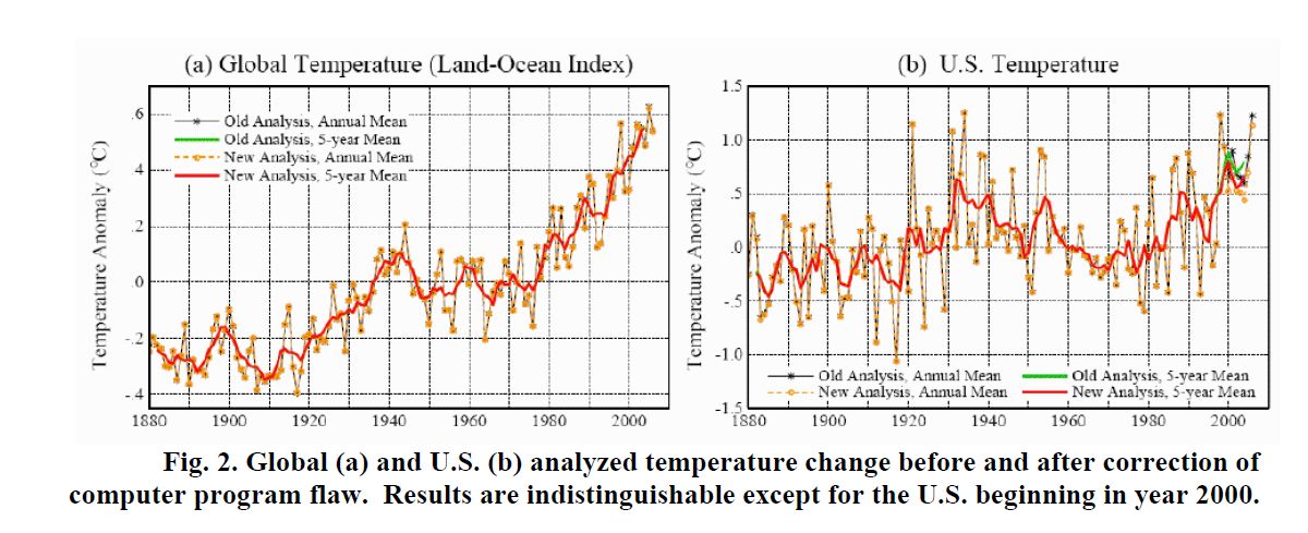
Flaws in temperature analysis. Figure 2 illustrates an error that developed in the GISS analysis when we introduced, in our 2001 paper, an improvement in the United States temperature record. The change consisted of using the newest USHCN (United States Historical Climatology Network) analysis for those U.S. stations that are part of the USHCN network. This improvement, developed by NOAA researchers, adjusted station records that included station moves or other discontinuities. Unfortunately, I made an error by failing to recognize that the station records we obtained electronically from NOAA each month, for these same stations, did not contain the adjustments. Thus there was a discontinuity in 2000 in the records of those stations, as the prior years contained the adjustment while later years did not.
The error was readily corrected, once it was recognized. Figure 2 shows the global and U.S. temperatures with and without the error. The error averaged 0.15°C over the contiguous 48 states, but these states cover only 1½ percent of the globe, making the global error negligible.
However, the story was embellished and distributed to news outlets throughout the country. Resulting headline: NASA had cooked the temperature books – and once the error was corrected 1998 was no longer the warmest year in the record, instead being supplanted by 1934.
This was nonsense, of course. The small error in global temperature had no effect on the ranking of different years. The warmest year in our global temperature analysis was still 2005. Conceivably confusion between global and U.S. temperatures in these stories was inadvertent. But the estimate for the warmest year in the U.S. had not changed either. 1934 and 1998 were tied as the warmest year (Figure 2b) with any difference (~0.01°C) at least an order of magnitude smaller than the uncertainty in comparing temperatures in the 1930s with those in the 1990s.
The obvious misinformation in these stories, and the absence of any effort to correct the stories after we pointed out the misinformation, suggests that the aim may have been to create distrust or confusion in the minds of the public, rather than to transmit accurate information.
We thought we had learned the necessary lessons from this experience. We put our analysis program on the web. Everybody was free to check the program, if they were concerned that any data “cooking” may be occurring.
Unfortunately, another data problem occurred in 2008. In one of the three incoming data streams, the one for meteorological stations, the November 2008 data for many Russian stations was a repeat of October 2008 data. It was not our data record, but we properly had to accept the blame for the error, because the data was included in our analysis. Occasional flaws in input data are normal in any analysis, and the flaws are eventually noticed and corrected if they are substantial. Indeed, we have an effective working relationship with NOAA – when we spot data that appears questionable we inform the appropriate people at the National Climate Data Center – a relationship that has been scientifically productive.
This specific data flaw was a case in point. The quality control program that NOAA runs on the data from global meteorological stations includes a check for repetition of data: if two consecutive months have identical data the data is compared with that at the nearest stations. If it appears that the repetition is likely to be an error, the data is eliminated until the original data source has verified the data. The problem in 2008 escaped this quality check because a change in their program had temporarily, inadvertently, omitted that quality check.
The lesson learned here was that even a transient data error, however quickly corrected provides fodder for people who are interested in a public relations campaign, rather than science. That means we cannot put the new data each month on our web site and check it at our leisure, because, however briefly a flaw is displayed, it will be used to disinform the public. Indeed, in this specific case there was another round of “fraud” accusations on talk shows and other media all around the nation.
Another lesson learned. Subsequently, to minimize the chance of a bad data point slipping through in one of the data streams and temporarily affecting a publicly available data product, we now put the analyzed data up first on a site that is not visible to the public. This allows Reto, Makiko, Ken and me to examine maps and graphs of the data before the analysis is put on our web site – if anything seems questionable, we report it back to the data providers for them to resolve. Such checking is always done before publishing a paper, but now it seems to be necessary even for routine transitory data updates. This process can delay availability of our data analysis to users for up to several days, but that is a price that must be paid to minimize disinformation.
Is it possible to totally eliminate data flaws and disinformation? Of course not. The fact that the absence of incriminating statements in pirated e-mails is taken as evidence of wrongdoing provides a measure of what would be required to quell all criticism. I believe that the steps that we now take to assure data integrity are as much as is reasonable from the standpoint of the use of our time and resources.

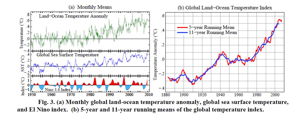
Temperature data – examples of continuing interest. Figure 3(a) is a graph that we use to help provide insight into recent climate fluctuations. It shows monthly global temperature anomalies and monthly sea surface temperature (SST) anomalies. The red-blue Nino3.4 index at the bottom is a measure of the Southern Oscillation, with red and blue showing the warm (El Nino) and cool (La Nina) phases of sea surface temperature oscillations for a small region in the eastern equatorial Pacific Ocean.
Strong correlation of global SST with the Nino index is obvious. Global land-ocean temperature is noisier than the SST, but correlation with the Nino index is also apparent for global temperature. On average, global temperature lags the Nino index by about 3 months.
During 2008 and 2009 I received many messages, sometimes several per day informing me that the Earth is headed into its next ice age. Some messages include graphs extrapolating cooling trends into the future. Some messages use foul language and demand my resignation. Of the messages that include any science, almost invariably the claim is made that the sun controls Earth’s climate, the sun is entering a long period of diminishing energy output, and the sun is the cause of the cooling trend.
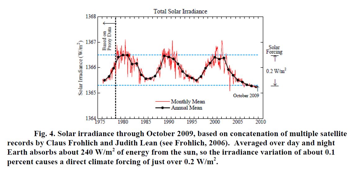
Indeed, it is likely that the sun is an important factor in climate variability. Figure 4 shows data on solar irradiance for the period of satellite measurements. We are presently in the deepest most prolonged solar minimum in the period of satellite data. It is uncertain whether the solar irradiance will rebound soon into a more-or-less normal solar cycle – or whether it might remain at a low level for decades, analogous to the Maunder Minimum, a period of few sunspots that may have been a principal cause of the Little Ice Age.

The direct climate forcing due to measured solar variability, about 0.2 W/m2, is comparable to the increase in carbon dioxide forcing that occurs in about seven years, using recent CO2 growth rates. Although there is a possibility that the solar forcing could be amplified by indirect effects, such as changes of atmospheric ozone, present understanding suggests only a small amplification, as discussed elsewhere (Hansen 2009). The global temperature record (Figure 1) has positive correlation with solar irradiance, with the amplitude of temperature variation being approximately consistent with the direct solar forcing. This topic will become clearer as the records become longer, but for that purpose it is important that the temperature record be as precise as possible.
Frequently heard fallacies are that “global warming stopped in 1998” or “the world has been getting cooler over the past decade”. These statements appear to be wishful thinking – it would be nice if true, but that is not what the data show. True, the 1998 global temperature jumped far above the previous warmest year in the instrumental record, largely because 1998 was affected by the strongest El Nino of the century. Thus for the following several years the global temperature was lower than in 1998, as expected.
However, the 5-year and 11-year running mean global temperatures (Figure 3b) have continued to increase at nearly the same rate as in the past three decades. There is a slight downward tick at the end of the record, but even that may disappear if 2010 is a warm year. Indeed, given the continued growth of greenhouse gases and the underlying global warming trend (Figure 3b) there is a high likelihood, I would say greater than 50 percent, that 2010 will be the warmest year in the period of instrumental data. This prediction depends in part upon the continuation of the present moderate El Nino for at least several months, but that is likely.
Furthermore, the assertion that 1998 was the warmest year is based on the East Anglia – British Met Office temperature analysis. As shown in Figure 1, the GISS analysis has 2005 as the warmest year. As discussed by Hansen et al. (2006) the main difference between these analyses is probably due to the fact that British analysis excludes large areas in the Arctic and Antarctic where observations are sparse. The GISS analysis, which extrapolates temperature anomalies as far as 1200 km, has more complete coverage of the polar areas. The extrapolation introduces uncertainty, but there is independent information, including satellite infrared measurements and reduced Arctic sea ice cover, which supports the existence of substantial positive temperature anomalies in those regions.
In any case, issues such as these differences between our analyses provide a reason for having more than one global analysis. When the complete data sets are compared for the different analyses it should be possible to isolate the exact locations of differences and likely gain further insights.
Summary
The nature of messages that I receive from the public, and the fact that NASA Headquarters received more than 2500 inquiries in the past week about our possible “manipulation” of global temperature data, suggest that the concerns are more political than scientific. Perhaps the messages are intended as intimidation, expected to have a chilling effect on researchers in climate change.
The recent “success” of climate contrarians in using the pirated East Anglia e-mails to cast doubt on the reality of global warming* seems to have energized other deniers. I am now inundated with broad FOIA (Freedom of Information Act) requests for my correspondence, with substantial impact on my time and on others in my office. I believe these to be fishing expeditions, aimed at finding some statement(s), likely to be taken out of context, which they would attempt to use to discredit climate science.
There are lessons from our experience about care that must be taken with data before it is made publicly available. But there is too much interesting science to be done to allow intimidation tactics to reduce our scientific drive and output. We can take a lesson from my 5- year-old grandson who boldly says “I don’t quit, because I have never-give-up fighting spirit!” http://www.columbia.edu/~jeh1/mailings/2009/20091130_FightingSpirit.pdf
There are other researchers who work more extensively on global temperature analyses than we do – our main work concerns global satellite observations and global modeling – but there are differences in perspectives, which, I suggest, make it useful to have more than one analysis. Besides, it is useful to combine experience working with observed temperature together with our work on satellite data and climate models. This combination of interests is likely to help provide some insights into what is happening with global climate and information on the data that are needed to understand what is happening. So we will be keeping at it.
*By “success” I refer to their successful character assassination and swift-boating. My interpretation of the e-mails is that some scientists probably became exasperated and frustrated by contrarians – which may have contributed to some questionable judgment. The way science works, we must make readily available the input data that we use, so that others can verify our analyses. Also, in my opinion, it is a mistake to be too concerned about contrarian publications – some bad papers will slip through the peer-review process, but overall assessments by the National Academies, the IPCC, and scientific organizations sort the wheat from the chaff.
The important point is that nothing was found in the East Anglia e-mails altering the reality and magnitude of global warming in the instrumental record. The input data for global temperature analyses are widely available, on our web site and elsewhere. If those input data could be made to yield a significantly different global temperature change, contrarians would certainly have done that – but they have not.
References
Frölich, C. 2006: Solar irradiance variability since 1978. Space Science Rev., 248, 672-673.
Hansen, J., D. Johnson, A. Lacis, S. Lebedeff, P. Lee, D. Rind, and G. Russell, 1981: Climate impact of increasing atmospheric carbon dioxide. Science, 213, 957-966.
Hansen, J.E., and S. Lebedeff, 1987: Global trends of measured surface air temperature. J. Geophys. Res., 92, 13345-13372.
Hansen, J., R. Ruedy, J. Glascoe, and Mki. Sato, 1999: GISS analysis of surface temperature change. J. Geophys. Res., 104, 30997-31022.
Hansen, J.E., R. Ruedy, Mki. Sato, M. Imhoff, W. Lawrence, D. Easterling, T. Peterson, and T. Karl, 2001: A closer look at United States and global surface temperature change. J. Geophys. Res., 106, 23947-23963.
Hansen, J., Mki. Sato, R. Ruedy, K. Lo, D.W. Lea, and M. Medina-Elizade, 2006: Global temperature change. Proc. Natl. Acad. Sci., 103, 14288-14293.
Hansen, J. 2009: “Storms of My Grandchildren.” Bloomsbury USA, New York. (304 pp.)
